Advertising is a visual medium, so it’s important for outdoor advertising agencies to use colours that will attract attention. While certain colours may be more effective than others, no colour is wrong or ineffective—rather, it depends on the context and situation. For example, red and yellow are common colours for traffic signs but can also be used in other ways. If you’re designing an ad for a coffee shop, you might want to use this colour combination to draw attention to your brand. If you’re designing an ad for a clothing store, you might want to go with purple instead.
The same thing goes for vibrational frequencies: no matter what kind of business you have or what type of product you sell, there are some colours or vibrations that are more likely to resonate with your target audience than others. For example, if you’re selling cars then maybe green isn’t the best choice when trying to get people’s attention—it might be easier for them to recognize red (which is a common colour in cars) instead!
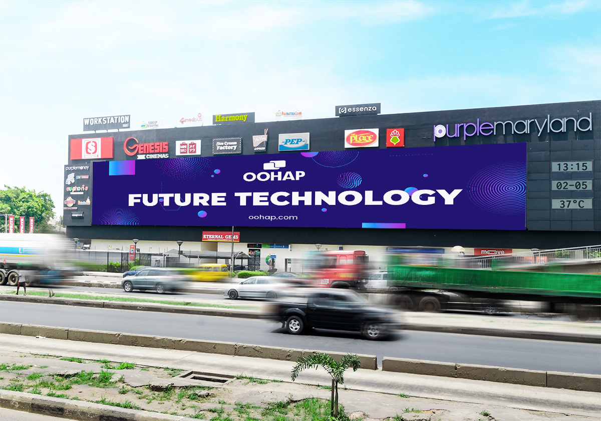
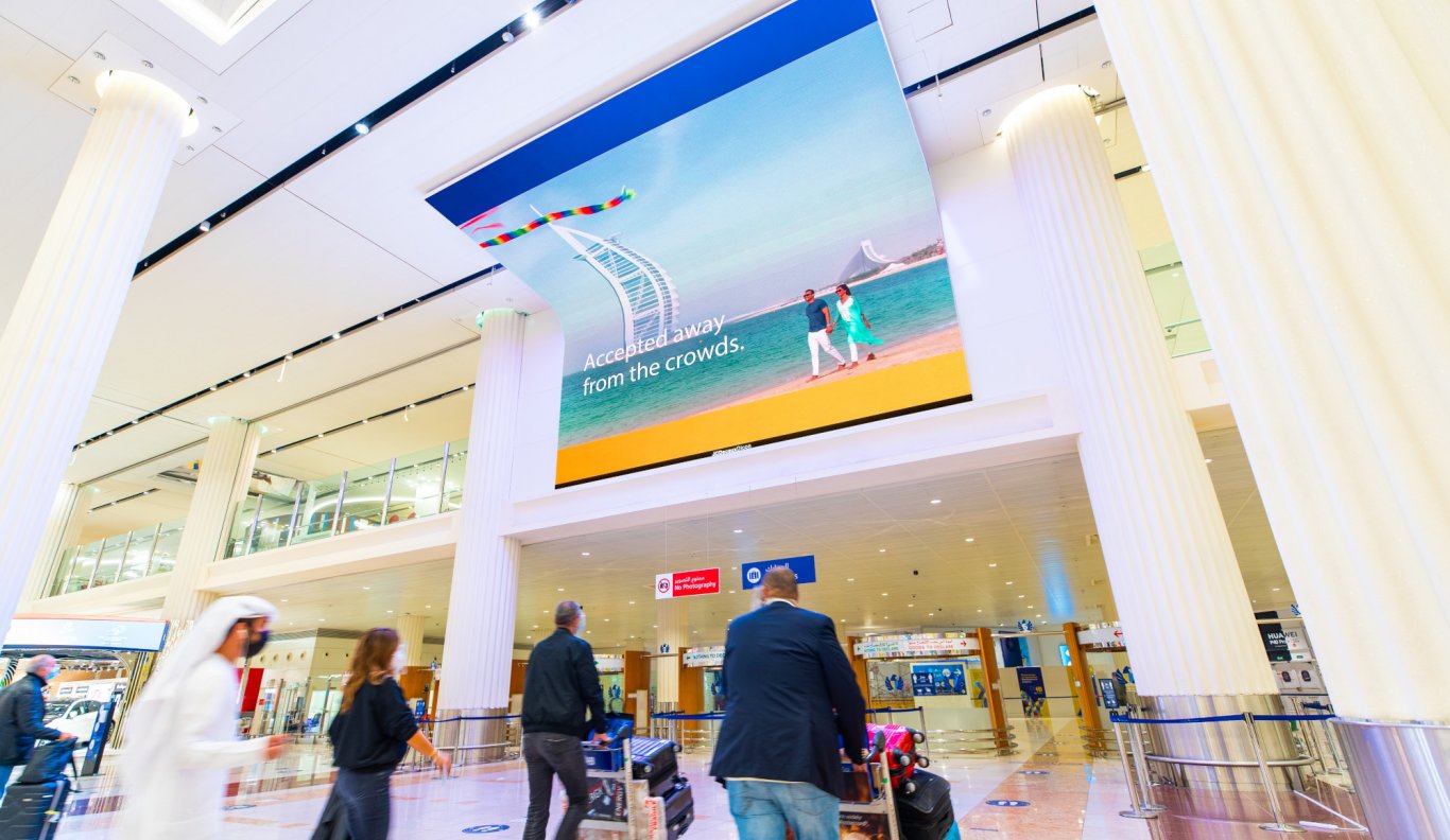
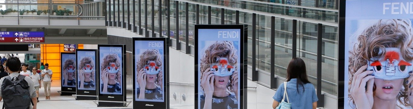
Visual construction is another factor when designing outdoor advertising. It doesn’t matter how many ads you place where they will get seen—if they don’t look professional and professional-looking then they won’t be effective at attracting potential customers